What do you get when you take an iconic legacy brand ready for an update and a desire to infuse a healthy dose of levity? A BBC America brand refresh that is eye-catching, versatile, and just the right amount cheeky, or you might say, Brit-ish.

A BBC America brand refresh that is eye-catching, versatile, and just the right amount cheeky, or you might say, Brit-ish.


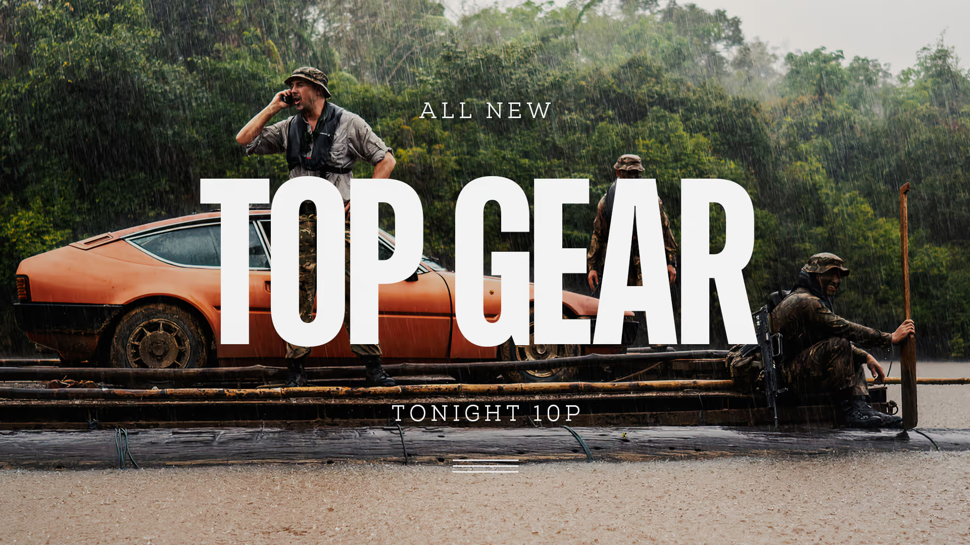
The ‘loud’ or American side of the brand used the Bluescreen font and the ‘reserved’ British side was Nexa Slab to call out a more refined and sophisticated tone. Promo messaging utilizes these fonts in combination with abstract flag elements.


Core brand components: The Bluescreens font in four weights and a color palette derived from the US and UK flags